Al-Mulook
THE CHALLENGE
Al-Mulook is a Kuwait-based perfume brand founded by Hatim, built around a clear belief: Luxury fragrances don’t need alcohol or ethanol to feel powerful.
The brand began with nothing more than a vision; handcrafted, alcohol-free perfumes formulated by the founder himself. What it needed was a brand system strong enough to carry a growing fragrance line while standing confidently in a premium Middle Eastern market.
Key challenges:
Positioning alcohol-free perfumes as luxury
Designing for a Kuwait audience with strong premium expectations
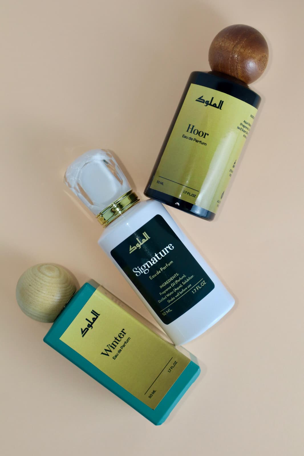
Creating a unified system across 30+ SKUs
Allowing fragrance individuality without visual chaos
Ensuring shelf clarity in a competitive perfume market
The brand had to feel royal but it also had to feel precise.
The Strategy
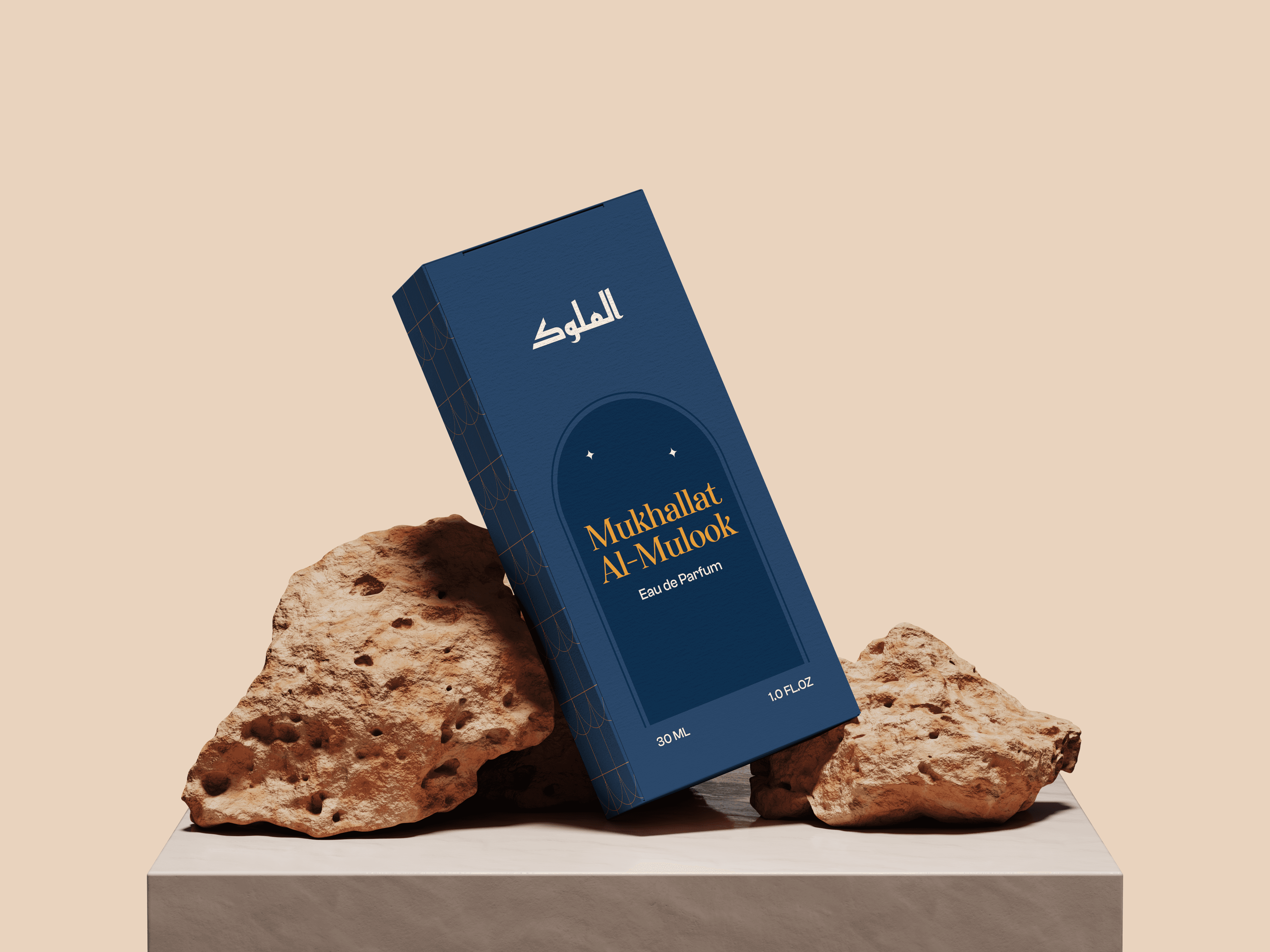
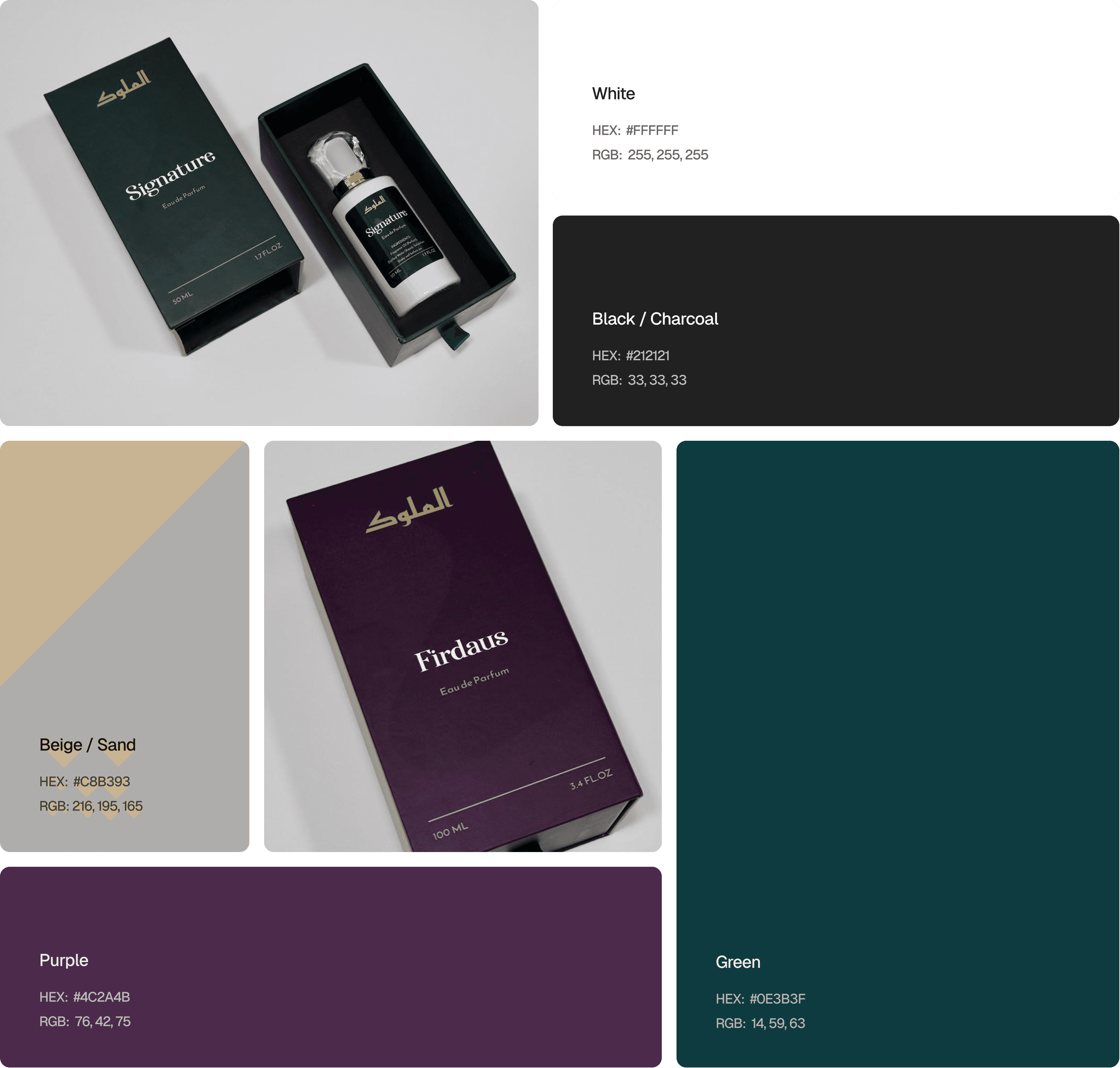
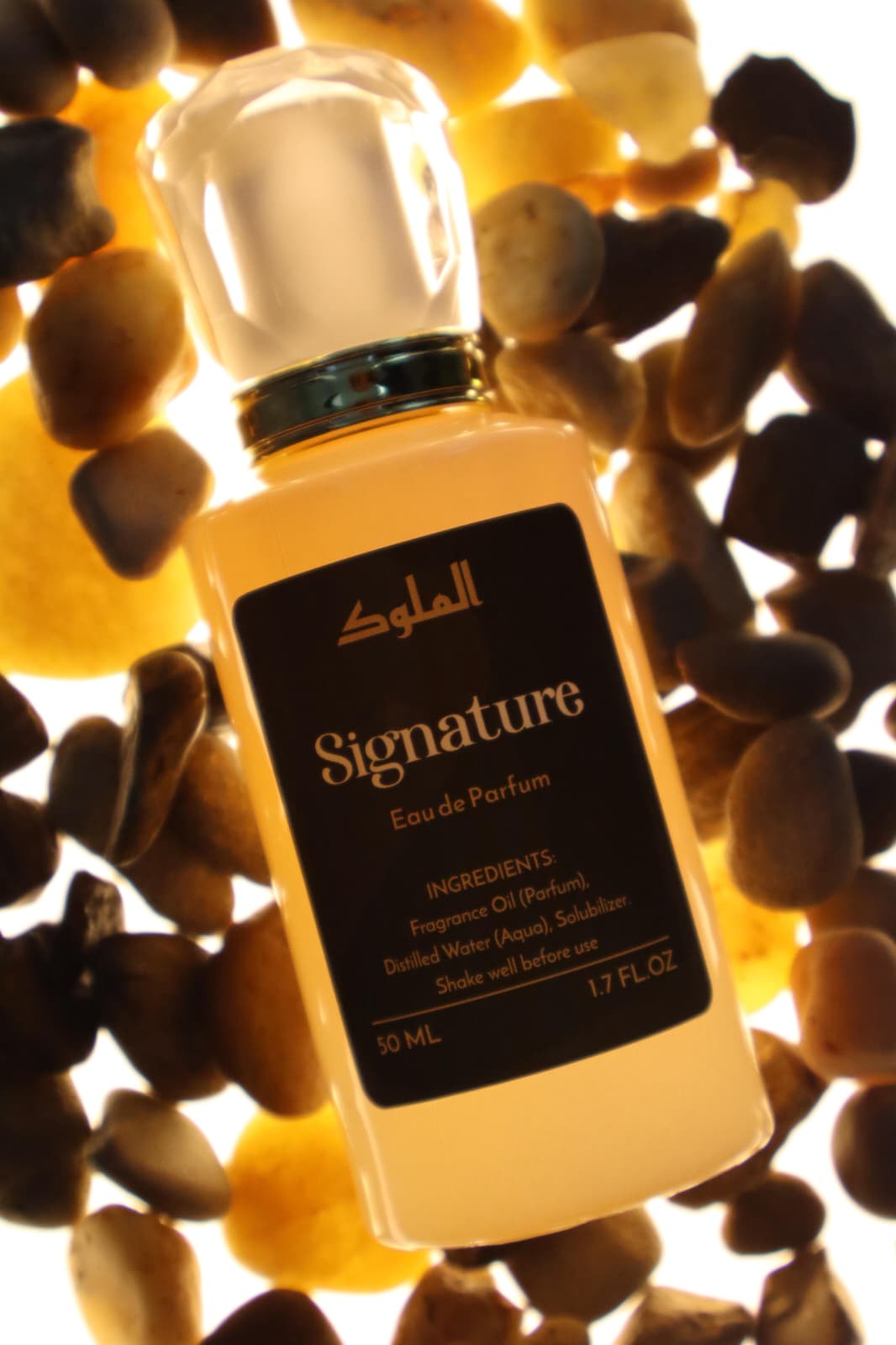
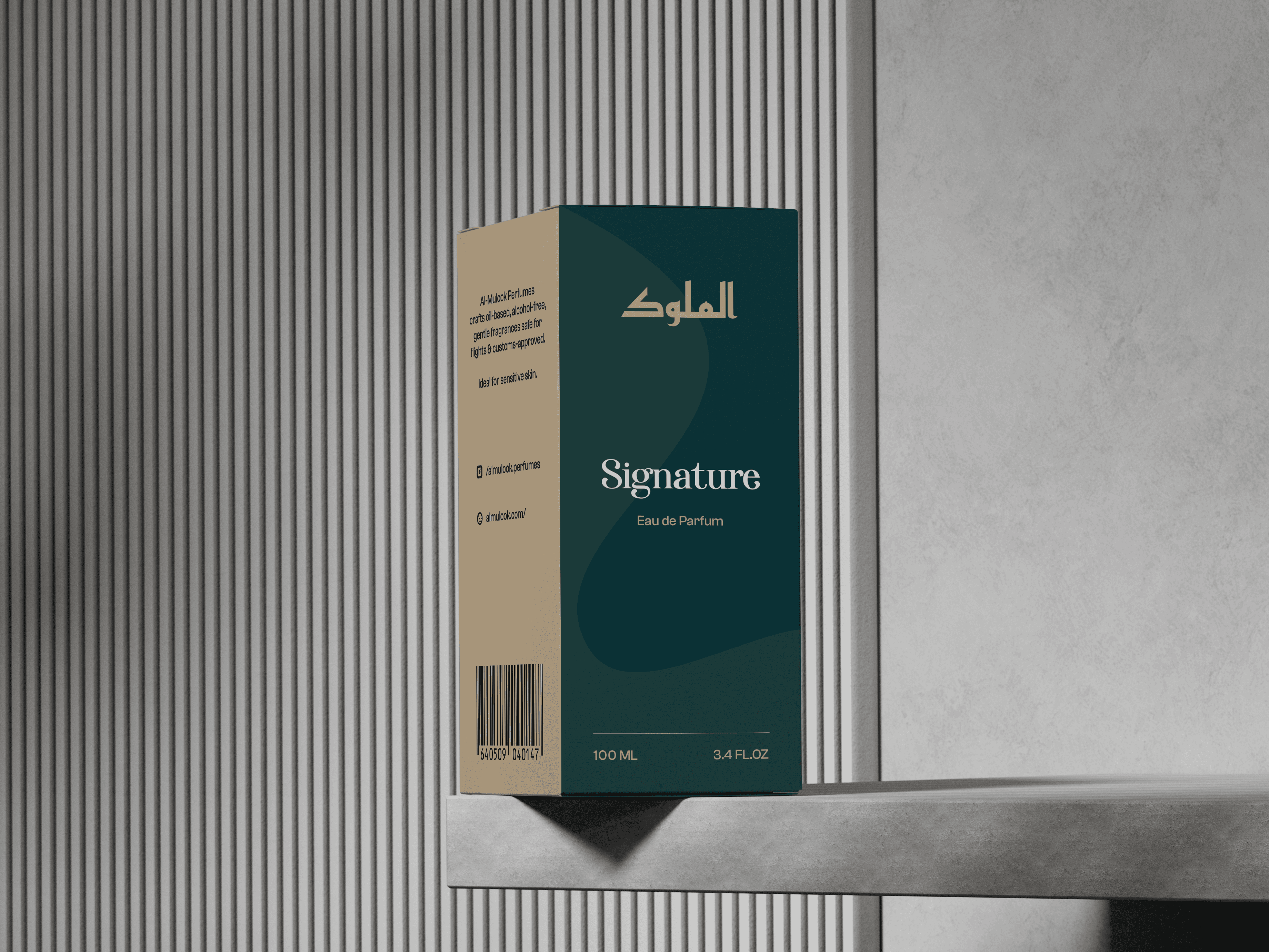
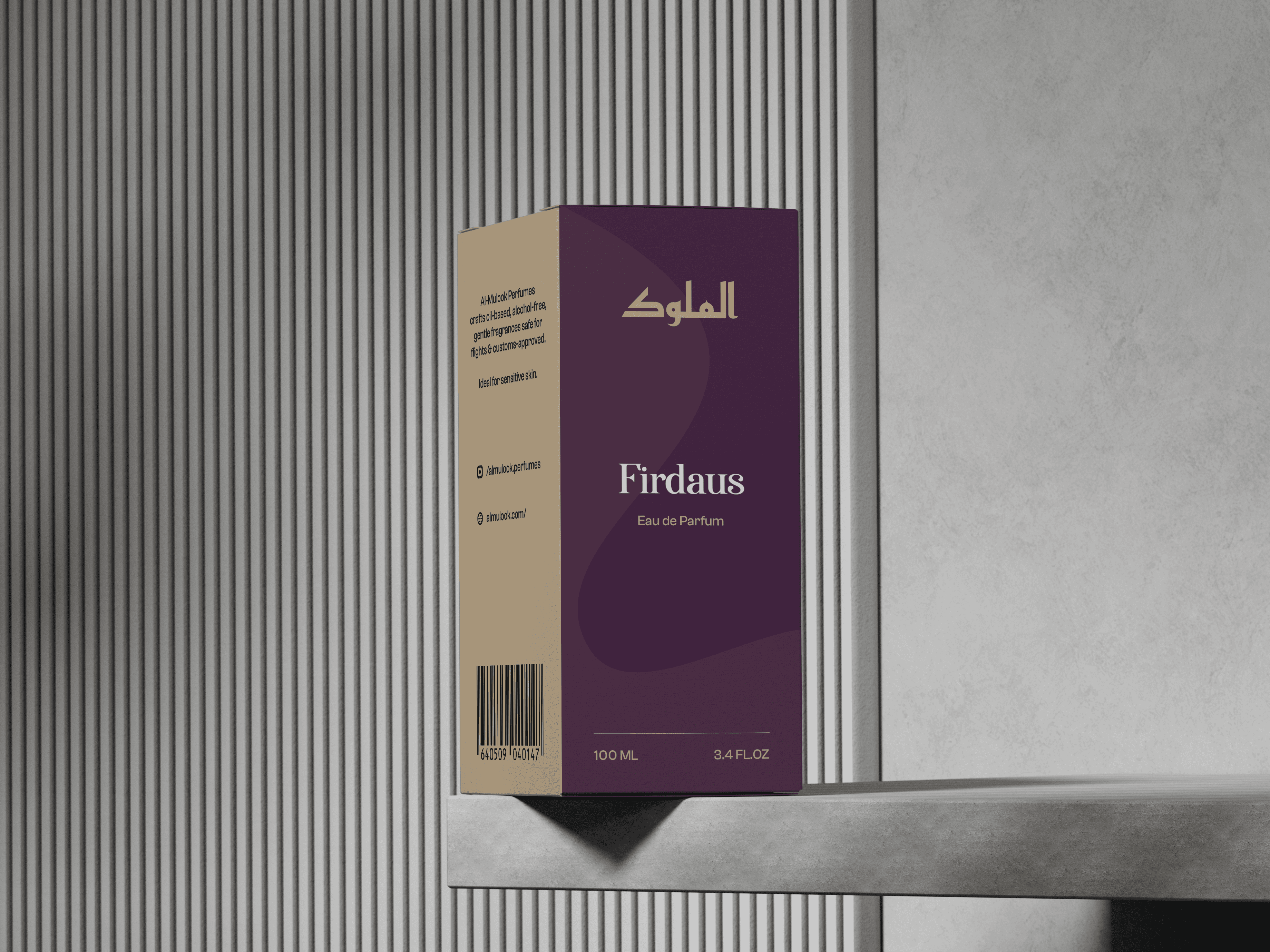
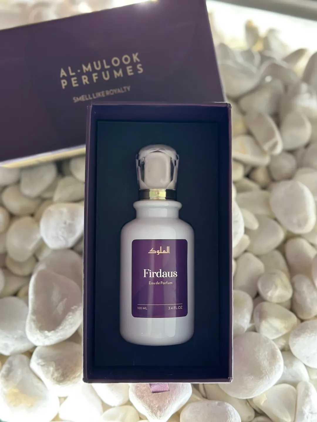
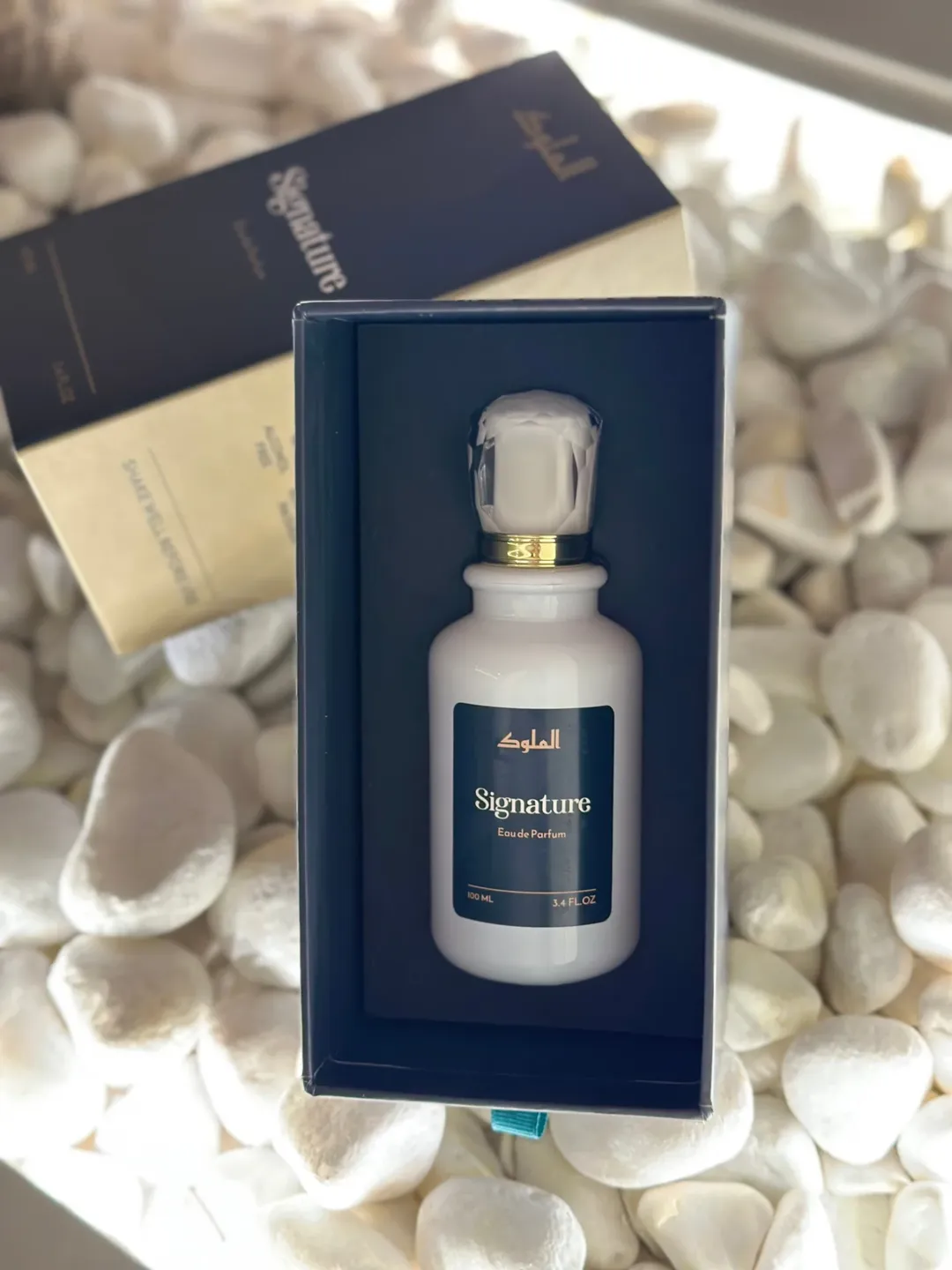
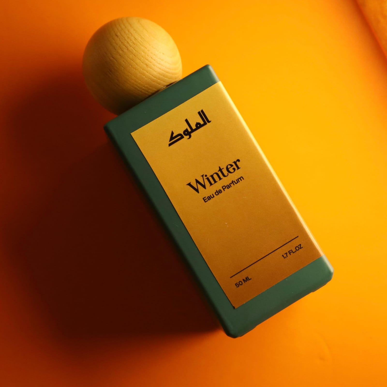
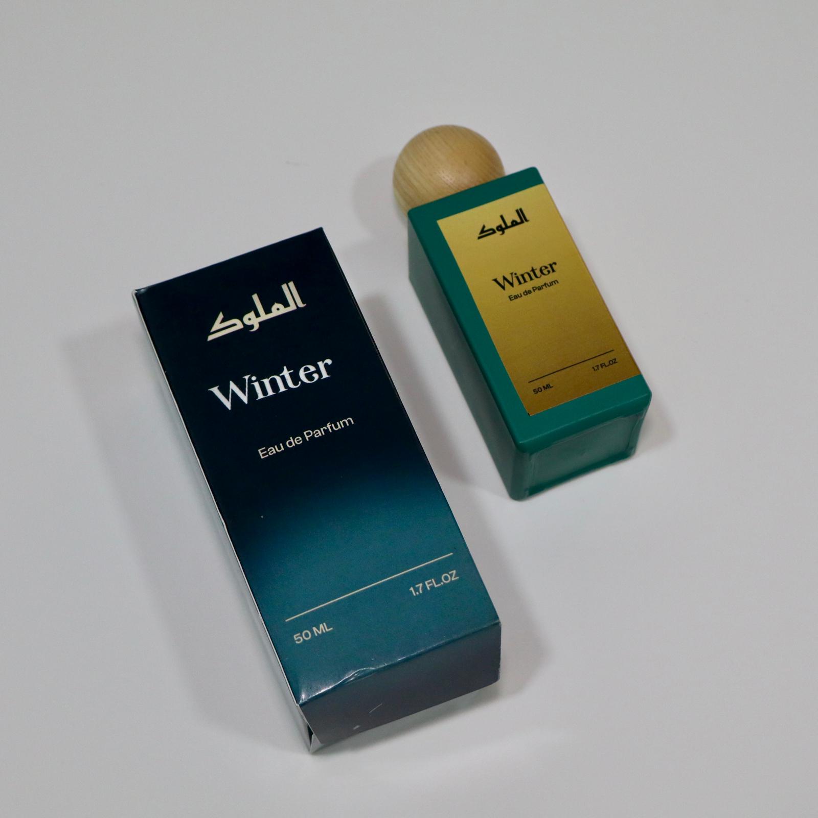
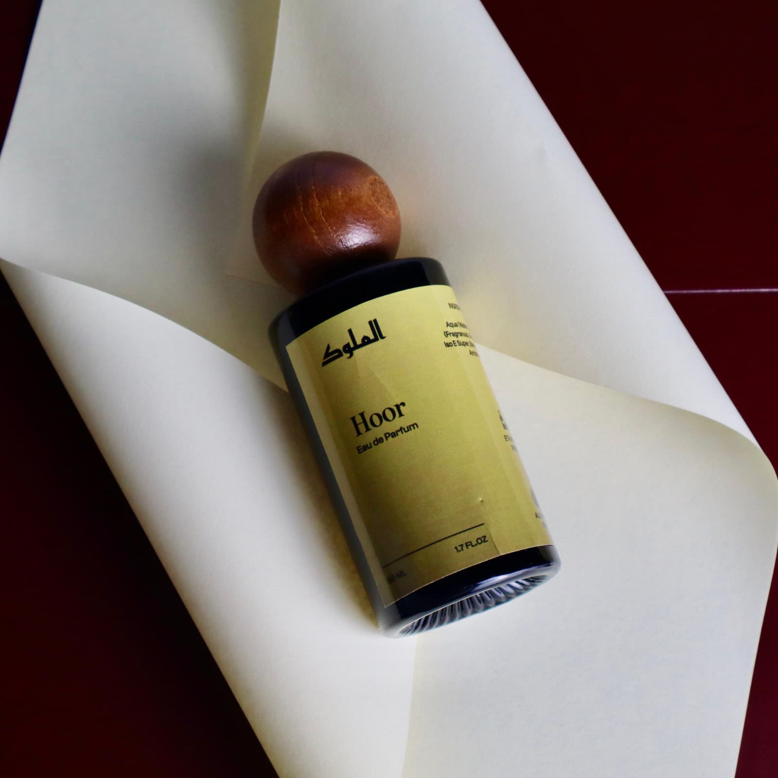
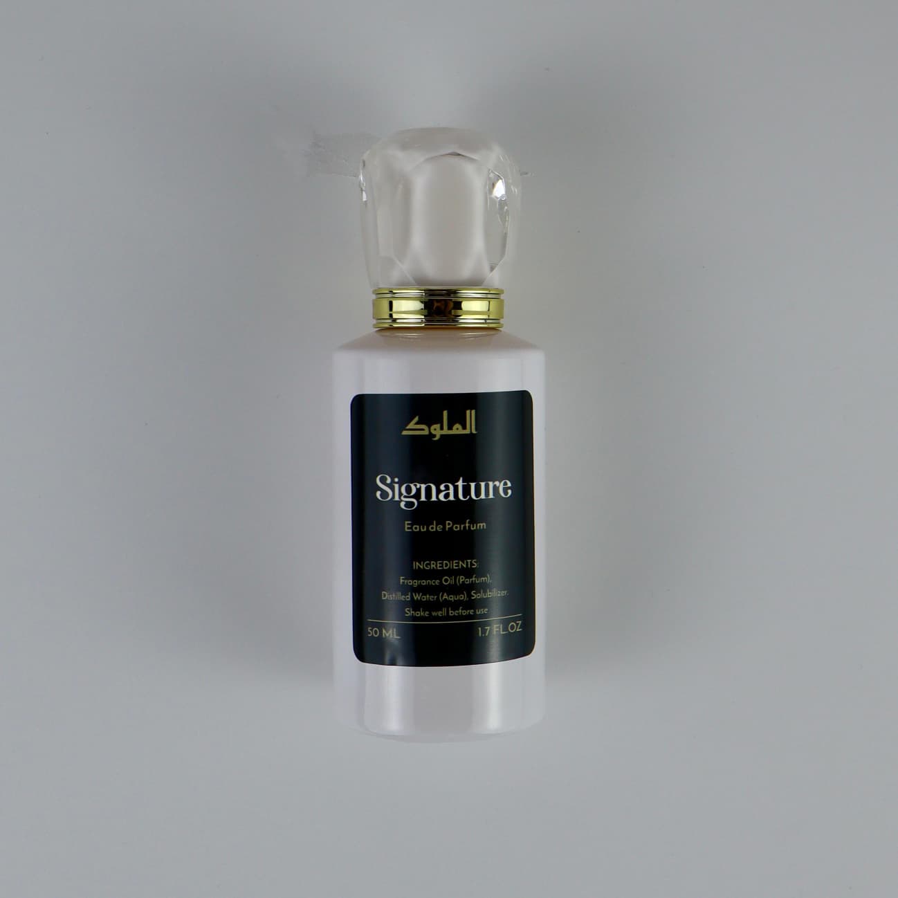
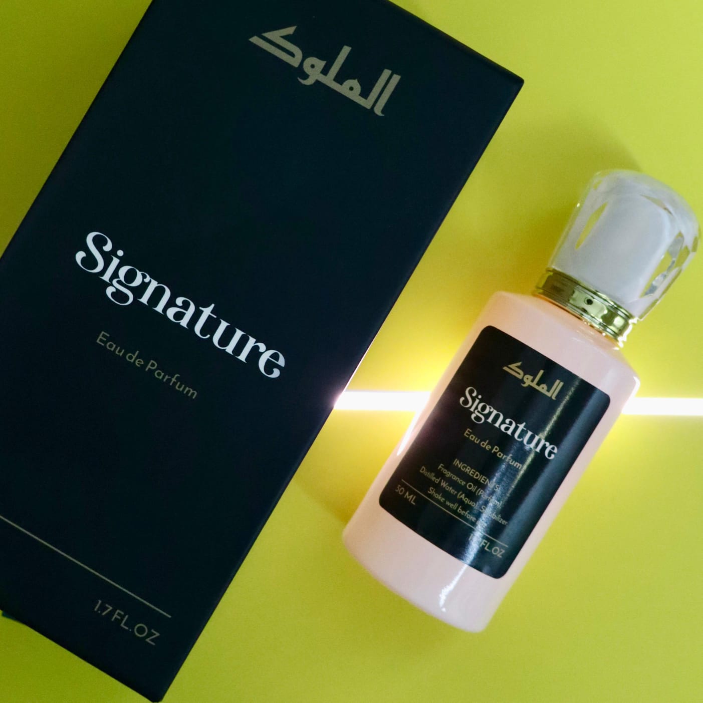
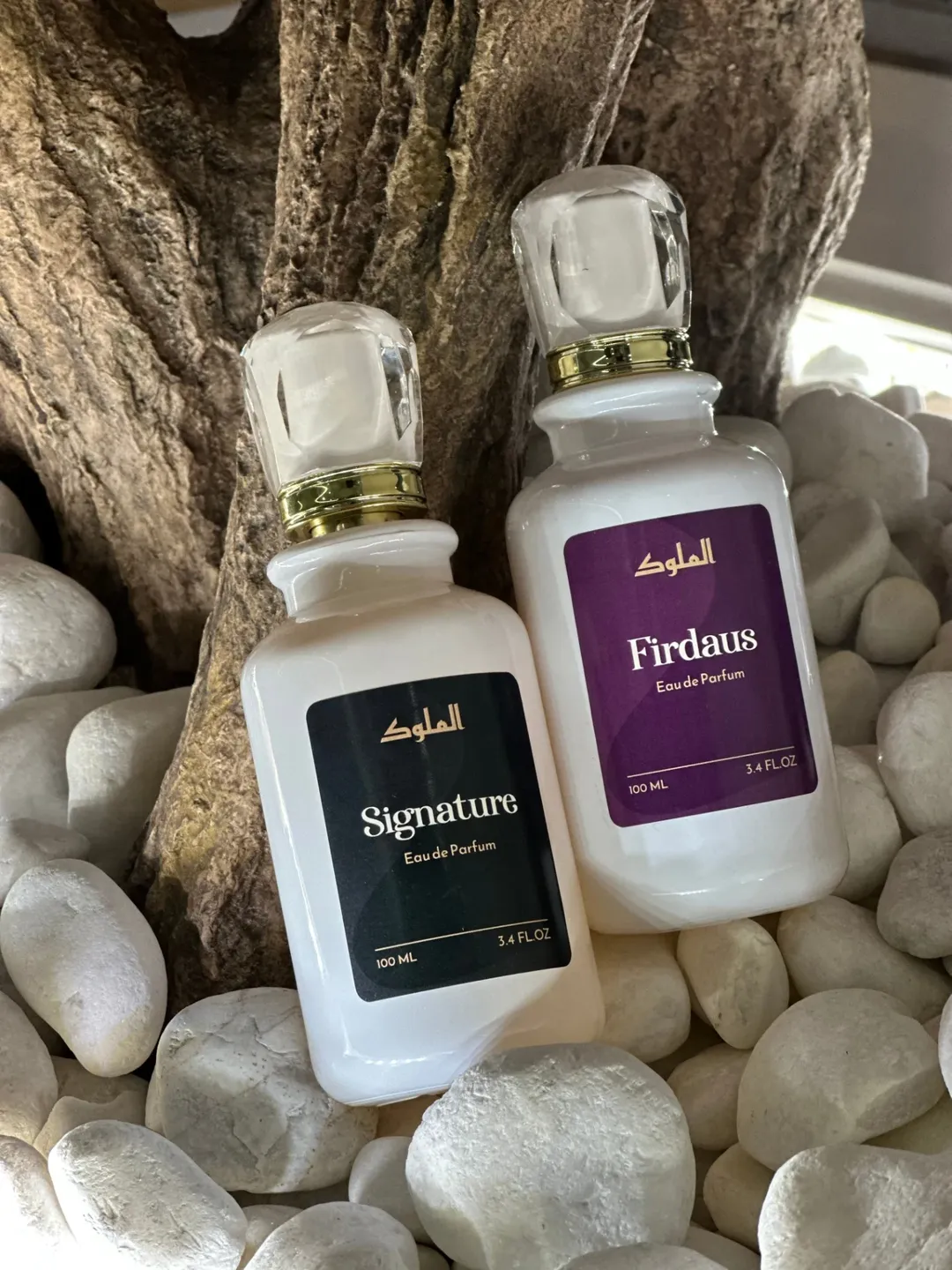
The color system began with two foundational tones: deep green and royal purple. These became the anchors for Al-Mulook’s first premium categories, Signature and Firdaus paired with beige, black, and white to balance depth with refinement.
The objective was clarity and control.
In a market where luxury often leans toward excess, the palette was intentionally restrained. No neon. No trend-led saturation. Every shade was selected to feel composed, premium, and shelf-confident.
As the SKU range expanded, the color system evolved; allowing variation across fragrances while maintaining tonal discipline. Each new addition had to feel elevated, not experimental.
The result was a scalable color architecture that allowed individuality without compromising brand cohesion.
The Process
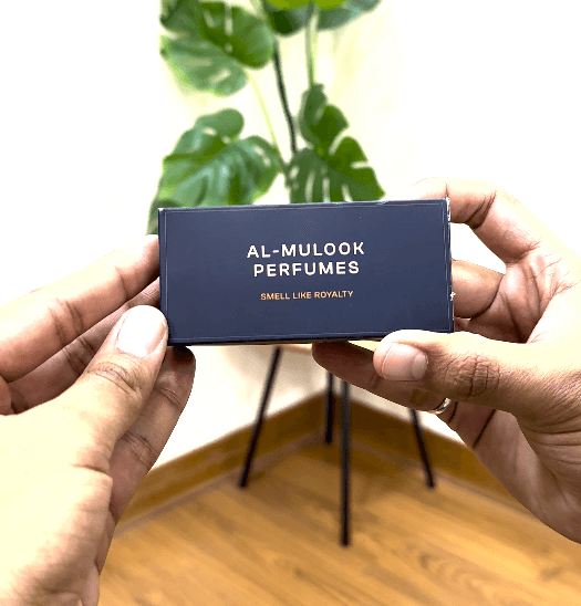
Typography was designed to communicate clarity before ornamentation.
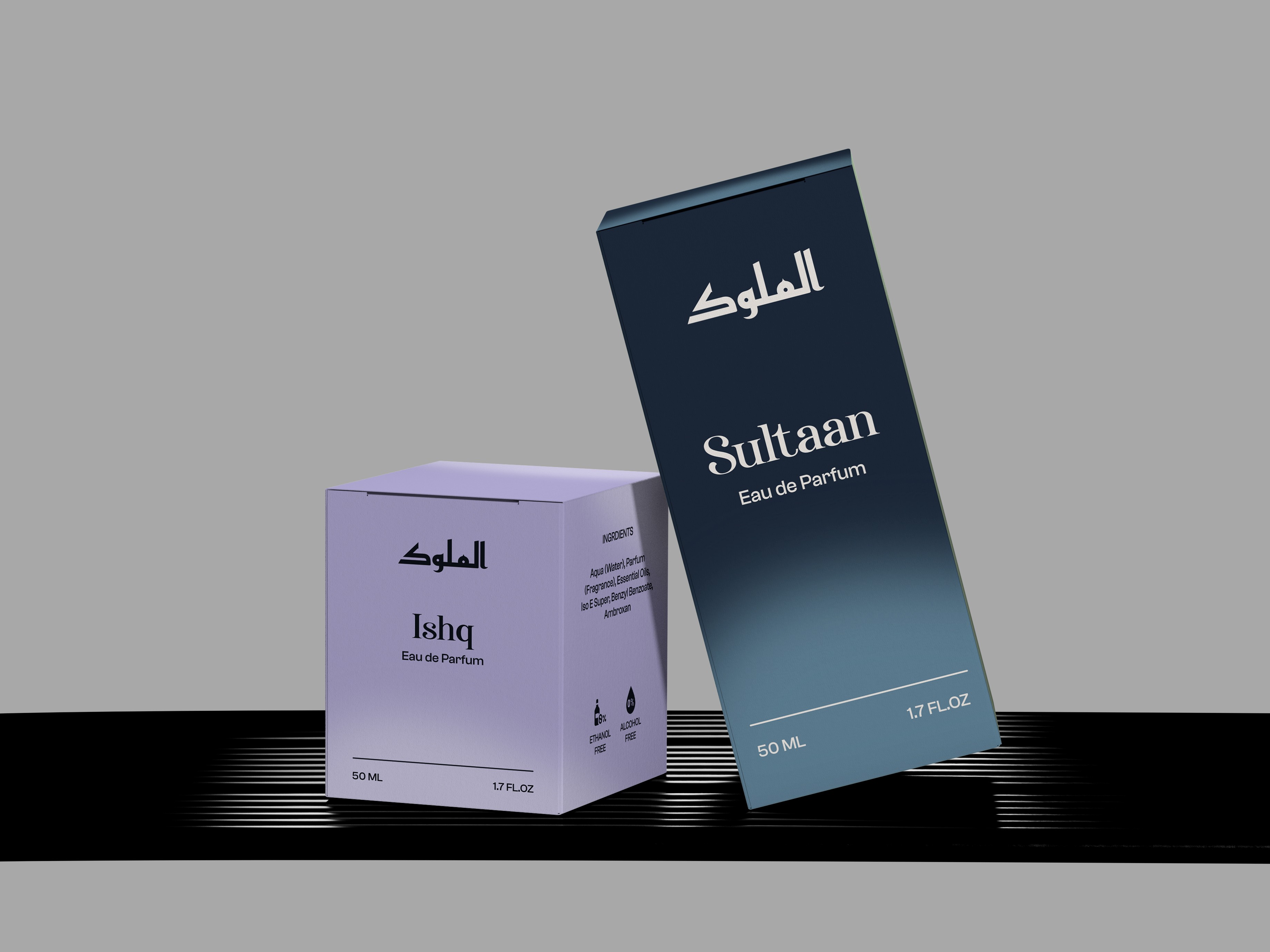
The type system balances modern serif sophistication with structured sans-serif precision. This combination allows fragrance names to feel expressive while maintaining legibility and hierarchy across packaging formats.
Clear spacing, controlled weight contrast, and disciplined alignment ensure:
Immediate readability
Strong shelf impact
Consistent brand recognition
In a fragrance category driven by emotion, typography became the stabilizing force.
The Execution
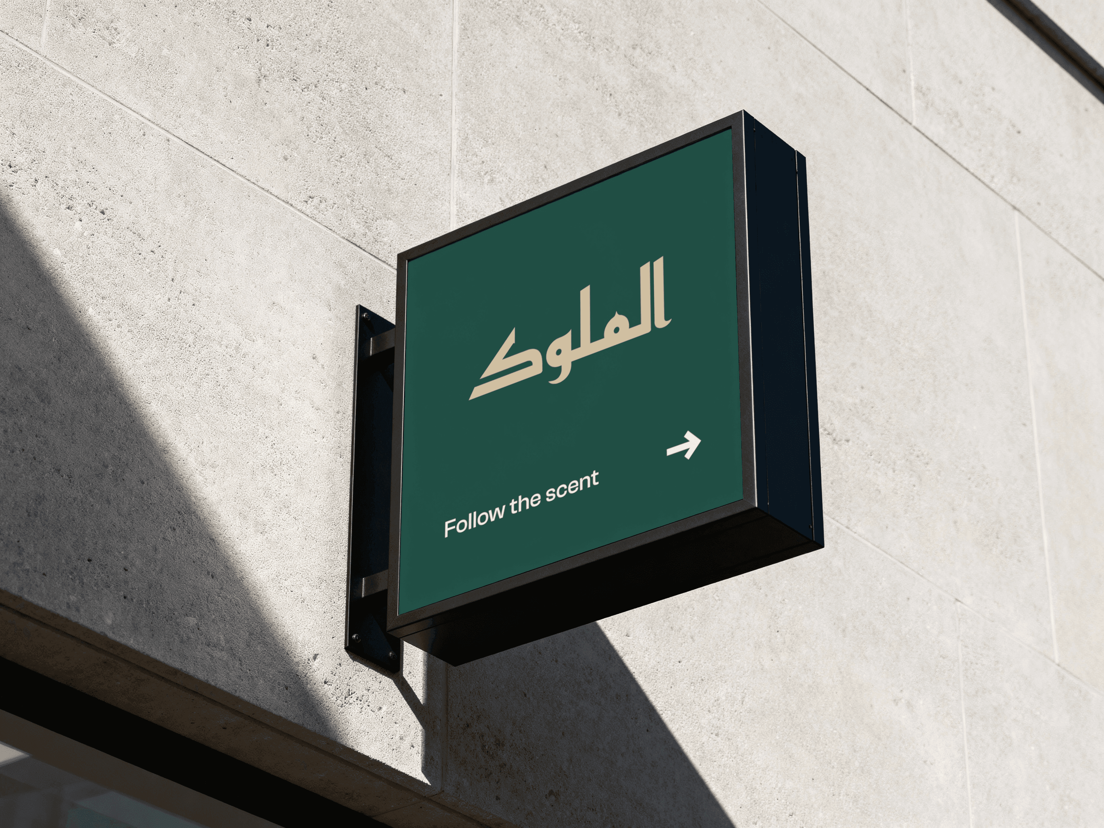
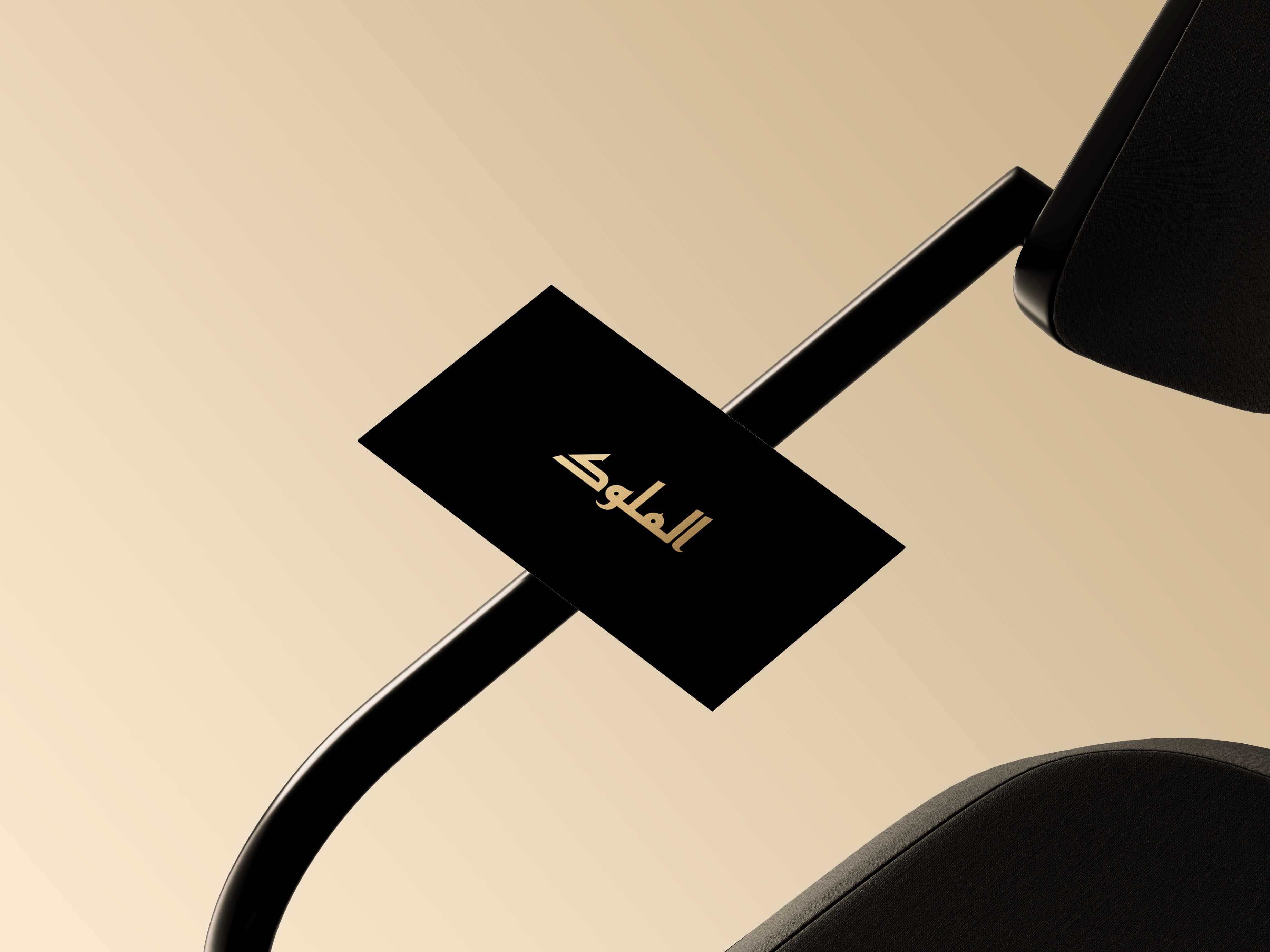
The logo development began with competitive landscape research across Kuwait and the broader Middle Eastern fragrance market.
The goal was not to mimic regional luxury cues; but to interpret them with restraint.
The final identity reflects:
Cultural relevance without cliché
Authority without heaviness
Modern simplicity with premium depth
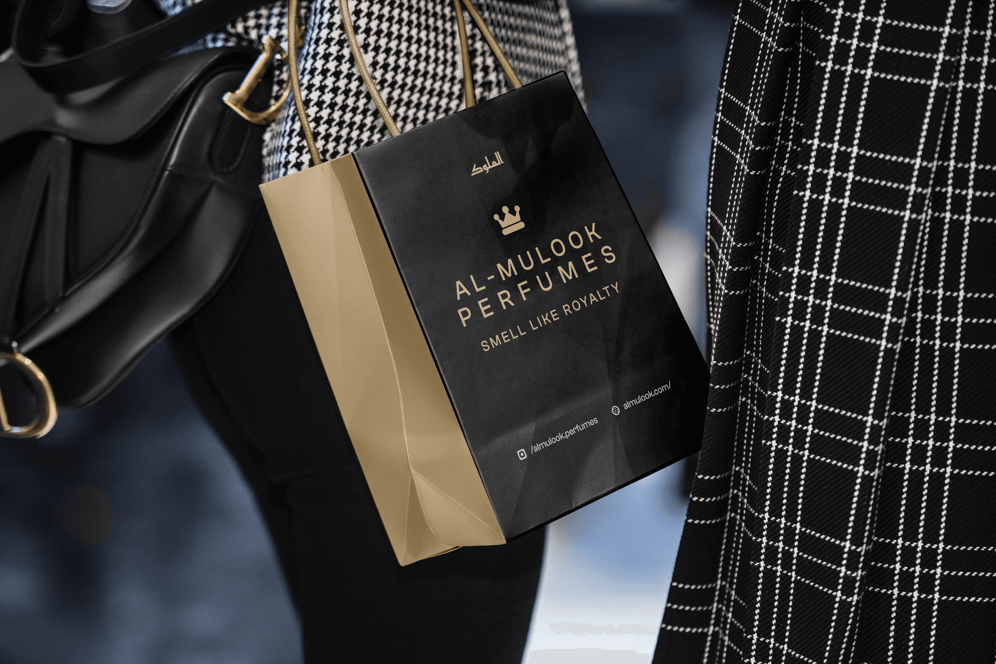
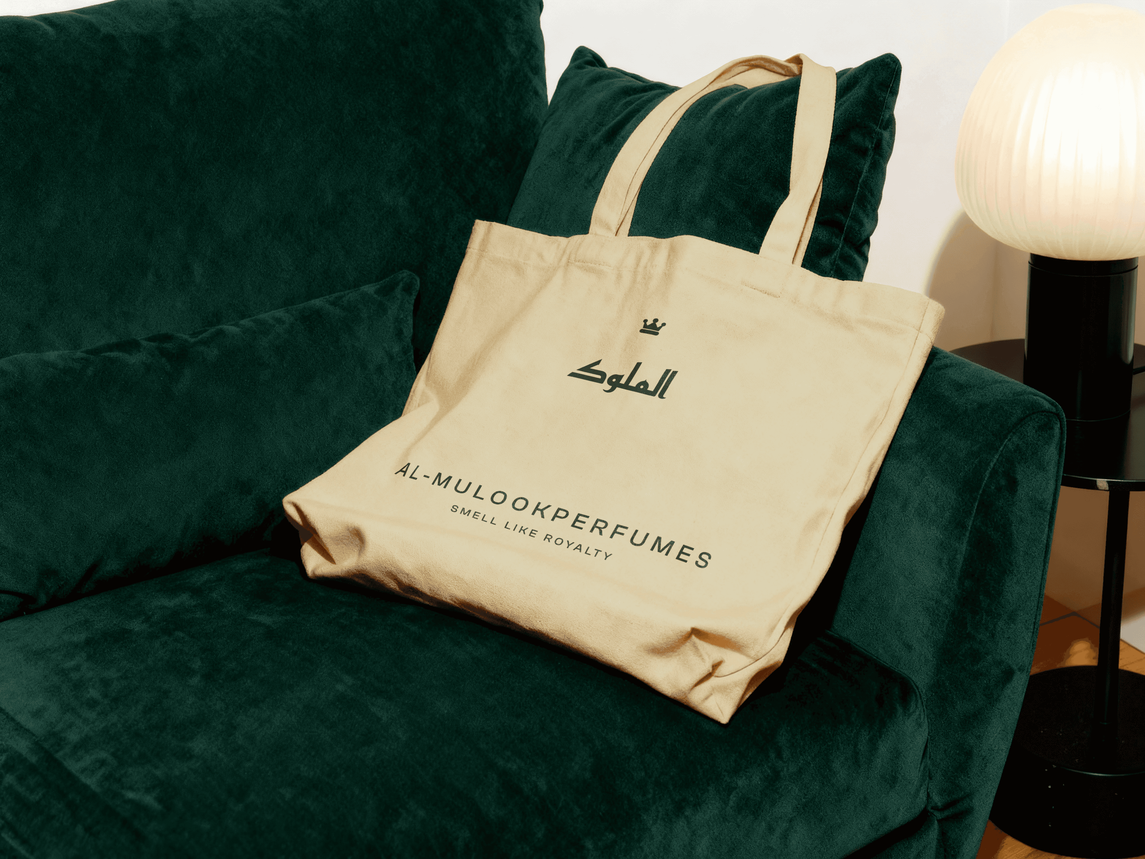
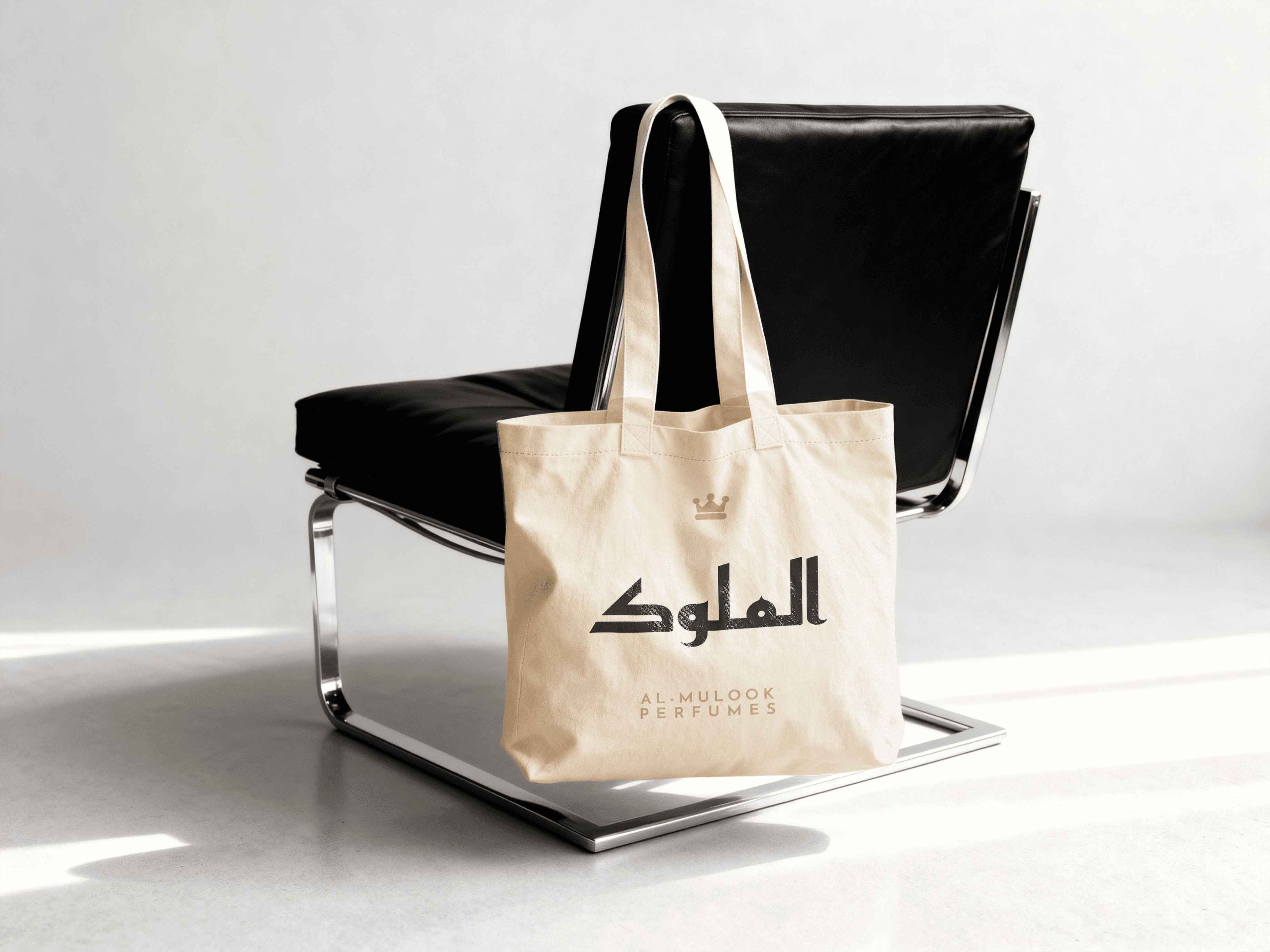
The visual system extends beyond the logo; incorporating layout grids, spacing principles, iconography, and brand alignment rules to ensure consistency across touchpoints.
From tote bags to fragrance boxes to digital presence, every application reinforces one unified brand language.
Scaling System
The primary challenge was designing packaging for over 30 fragrances, each with its own personality, without creating visual fragmentation.
The solution was a modular system.
Each SKU follows a structured framework:
Clear naming hierarchy
Ingredient transparency
Volume and pricing clarity
Controlled color expression
Consistent logo placement
This approach allowed each fragrance to feel distinct while operating within a disciplined architecture.
A scalable system built for long-term growth.
The Outcome
Al-Mulook entered the market with structure.
What began as a founder-led fragrance vision evolved into a premium, shelf-confident brand system built for scale. The clarity across color, hierarchy, and packaging turned alcohol-free positioning into a differentiator rather than a limitation.
The result wasn’t just aesthetic approval, it was commercial momentum.
— Hatim R.
Founder, Al-Mulook Perfumes
120
Uplift in initial sales
5
Brand showcase events
30
Fragrances launched
4.9
Customer Satistfaction


